
Pearl Ex 32-Color Set | Review & Color Chart
Ever since I got the Pearl Ex 32-Color Set this year (from Amazon), I've been wanting to do a review and make a color chart to reference for future projects. As you may already know from my Instagram posts, I use Pearl Ex quite a bit - as a calligraphy ink, as paint, IN wax seals, ON wax seals, you name it! And as a disclaimer, this post is not sponsored in any way, and everything I'm writing here is my honest opinion.
First of all, for those who aren't familiar with this product, Pearl Ex is a powdered mica pigment (safe and non-toxic) that is extremely versatile in its use. It can be mixed into almost any media and used on a variety of surfaces, including paper, metal, wood, plastic, fabric, wax, etc., to create a metallic look. As for me, I like to use Pearl Ex mostly as a calligraphy ink, which I will explain how to mix below.
Note that this isn't a complete set of Pearl Ex colors. For example, it doesn't include Pink Gold, Grey Lavender, Rose Gold, Carbon Black etc. Here is a list of all the colours that are available in this 32-Color Set:


Review
Majority of the colors are fantastic, and I would rate them 5/5. But instead of going through every single color, I will comment on a few that really stood out (both good and bad).
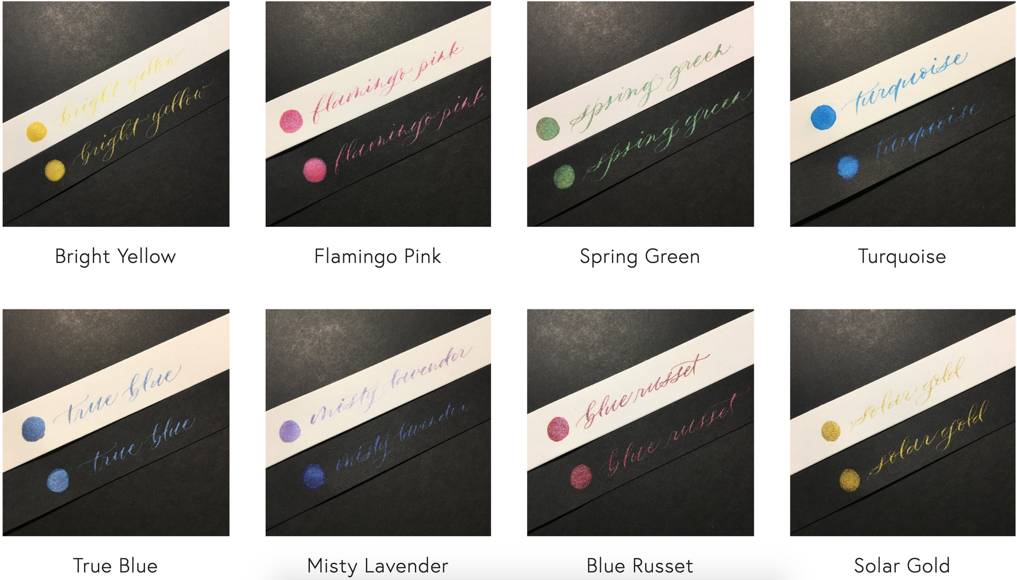
- Turquoise and Flamingo Pink were really hard to mix at first because they were hard to dissolve. There was always a layer of dry pigment floating on the top no matter how much I tried to stir, and when I tried to apply some ink to my nibs with a brush, the mix felt very grainy. As a result, I didn't touch this mix for months. About a week ago when I tried them again, I discovered that Turquoise still had the same problem, but Flamingo Pink eventually did dissolve and the colour is actually very gorgeous and vibrant.
- Interference (Red/Blue/Violet/Green/Gold) are interesting colors because they basically look like white pearl, but under certain angles/lighting, they give off another color. On white paper, these 5 interference shades look almost completely the same and they blend in with white paper. But as soon as you use it on black paper, each of its colors really start to show.
- Duo (Red-Blue/Green-Purple/Violet-Brass) are similar to the interference shades except they're not mixed in with the white pearl shade, but another color. I like that they catch me off guard and show multiple colors depending on how I look at it.
- My favourites - For no particular reason, I find myself using the following colors most frequently: True Blue, Silver, Antique Copper, Antique Gold and Duo Violet-Brass.
If you go through the color chart, you'll notice a lot of colors look very similar, such as Silver and Antique Silver, the first three Pearl colors, and several of the golds etc. If you're thinking of buying Pearl Ex individually, I wouldn't recommend getting all of them since they really have minute differences.
Pearl Ex Calligraphy Ink
The ratio I use to mix my Pearl Ex inks is 4:1 + water. Four parts mica powder to one part gum arabic. Gum arabic is the powder that binds the pigments together so that when the ink dries, it will not turn back into powder form and brush away.
The mixture doesn't have to be extremely precise, and you can use anything to approximate your measurements. I personally use a small spoon and scoop out 4 spoonful of pearl ex, then 1 spoonful of gum arabic. I love this ratio because the ink dries raised and I am obsessed with running my fingers across the letters after it dries.
The amount of water is a rough guesstimate, I use a plastic pipette to add in the water slowly, and test it out as I go. A good indication that you need to add more water is if the ink gets stuck on your nib and doesn't flow when you write. And a sign that you've added too much water is if the ink starts to pool. To fix this, either add in more of the 4:1 mix or let it sit for the water to evaporate overtime.
Also it does not matter if you're using powdered or liquid gum arabic, the results should be the exact same. I personally use the powder, and that's only because I ordered this first.
Color chart
Disclaimer: All pictures are unedited and are taken under the same lighting (lamp light) & same approximate angle. Colors are displayed in order of the color chart above.


I hope you have found this post helpful and will use it as a reference for yourself when choosing colors for future projects. If you have any questions or suggestions for things I've not covered about Pearl Ex here, feel free to comment below or shoot me an email.
Happy Writing!
With love,
Jessie